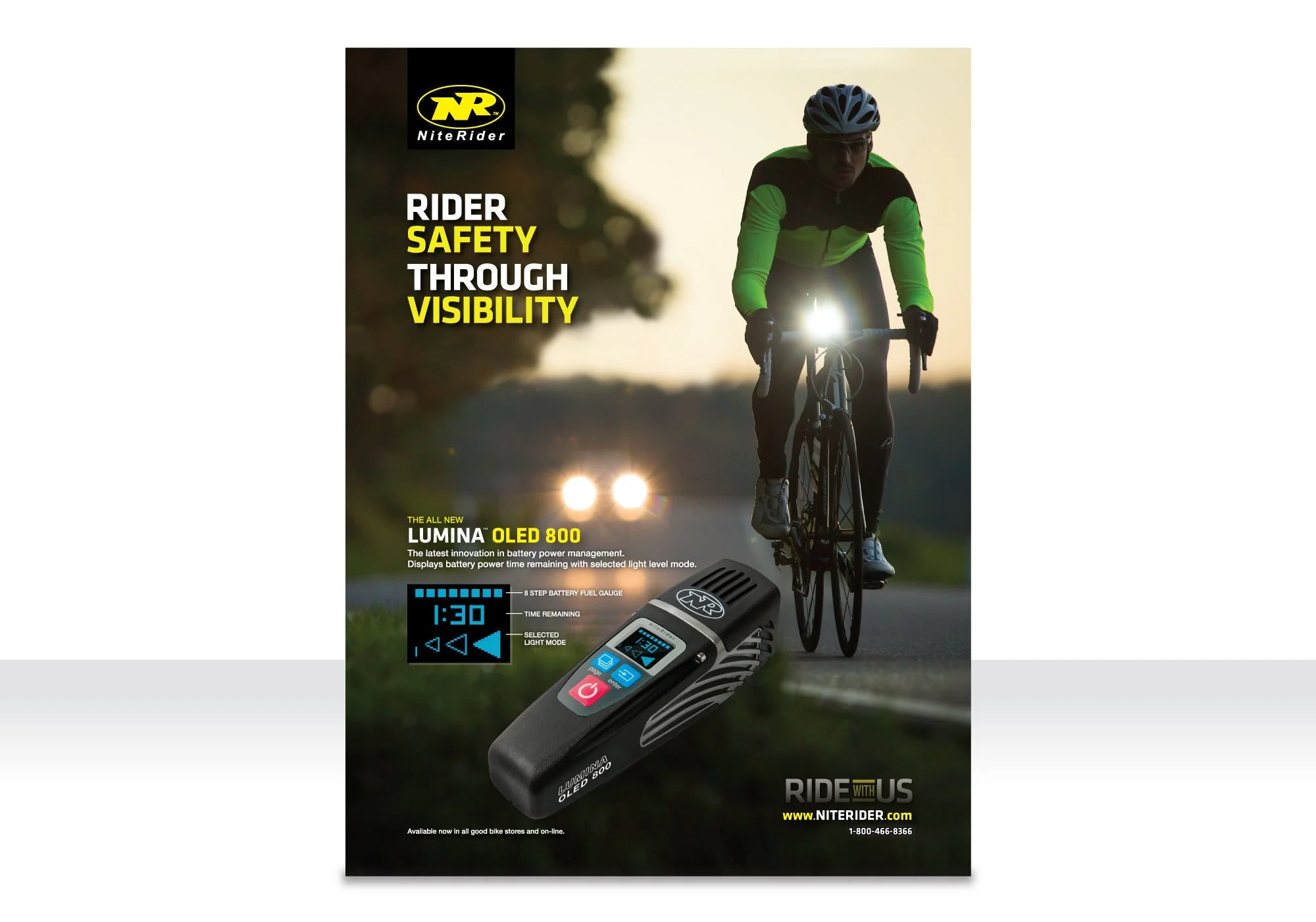
One Page Print Ad
Goal: Promote rider safety with high-visibility lights
Joined NiteRider in 2014 as an in-house Graphic Designer to expand advertising and evolve the brand’s creative direction.
Key Highlights:
Designed first major one-page print ad, shifting from dark, high-contrast visuals to a brighter, more inviting look.
Created campaign slogan: “Rider Safety Through Visibility”, emphasizing safety and brand values.
Applied typography, layout, and color to make messaging clear, engaging, and on-brand.
Collaborated with marketing and product teams to ensure creative aligned with technical features and company messaging.
Skills in Action:
Art direction & visual storytelling
Brand evolution & consistency
Marketing design & campaign strategy
Cross-team collaboration